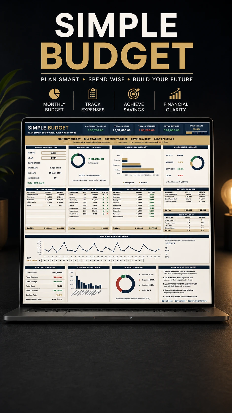
A budget only works if you can see the gap between what you planned and what actually happened. This sheet is built entirely around that comparison.
Five tables — income, bills, expenses, savings and debt — each take a BUDGET figure and an ACTUAL figure. Every category is renameable and you can add your own. From those five tables the whole dashboard assembles itself.
The number at the top is the one you check daily: amount left to spend, which is income minus expenses minus savings. Beside it sit total income, total expenses, total savings and your savings rate.
In the expense table you tag each line as a Need or a Want, and that single choice drives the allocation summary — what percentage of your income went to needs, wants, savings and debt. It is the fastest honest read on a month there is.
The bill tracker takes a due date and a paid tick, and reports bills paid so far out of the total, so nothing is quietly missed. A separate daily spending log runs across every day of the month with your logged total, highest day and daily average — optional, and independent of the tables.
Pick a month and a year and the date range, day count and day numbers follow along, including short months and February in a leap year. Only the white cells need typing; every total, percentage and bar fills in by itself.